Easy Beautiful Plots
Useful Code Snippets | | Links:
I know I’ve wasted a lot of time over the last few years making my matplotlib plots looks just right, and I’ve finally settled on a method that’s copy & paste and requires no fiddling to make plots always render nicely. It involves updating the matploitlibrc file to fine-tune the plot parameters to your liking, and once you’ve settled on settings you like, you can copy & paste it into any of your scripts or notebooks to get the plots to come out looking professional. You can find the documentation here should you want to read more on the topic.
Here’s an example of the settings I use and the associated code:
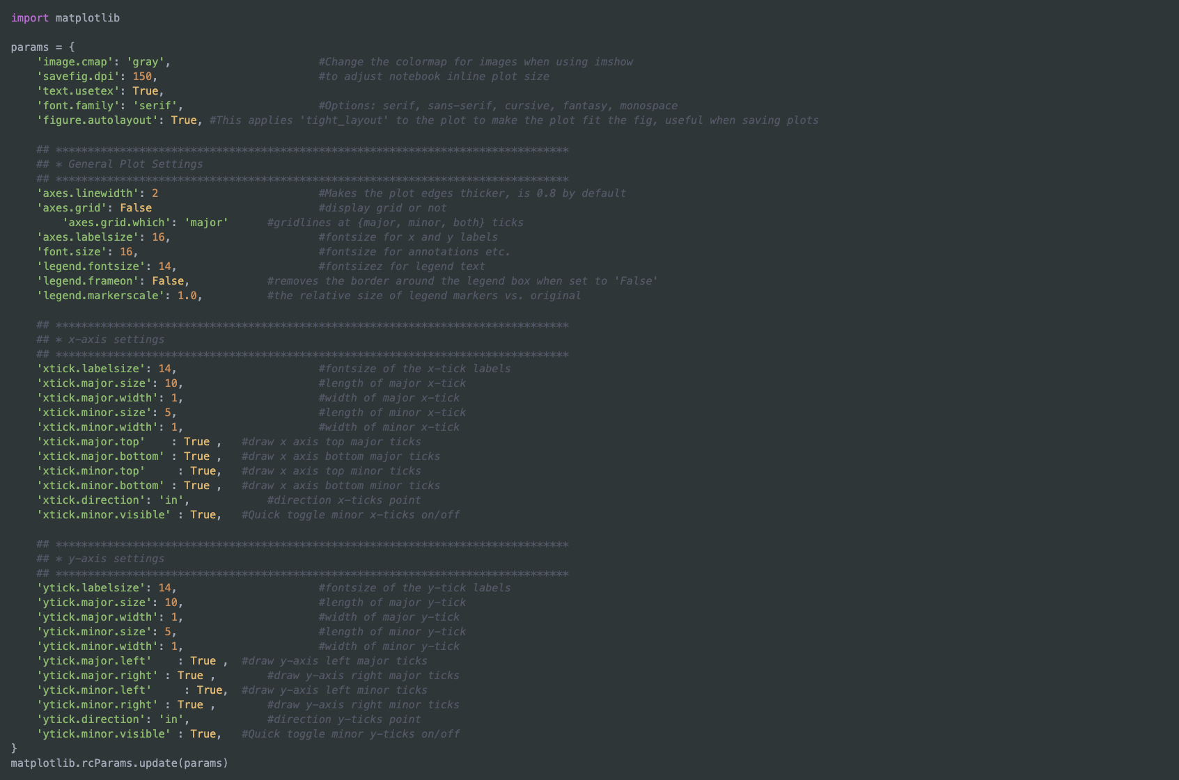
import matplotlib

params = {
    ## ********************************************************************************
    ## * General Settings
    ## ********************************************************************************
    'image.cmap': 'gray', 			#Change the colormap for images when using imshow
    'savefig.dpi': 150,  			#to adjust notebook inline plot size
    'text.usetex': True,            		#Use LaTeX to render. Allows you to use LaTeX for the figure text (axes, labels, etc.), but increases render time.
    								#I usually disable LaTeX for making plots quickly in Jupyter, as otherwise it takes rather long to display. You must have LaTeX on your computer for this to work!
    'font.family': 'serif',			#Options: serif, sans-serif, cursive, fantasy, monospace
    'figure.autolayout': True,      		#This applies 'tight_layout' to the plot to make the plot fit the fig, useful when saving plots

    ## ********************************************************************************
    ## * Axes Settings
    ## ********************************************************************************
    'axes.linewidth': 2,			#Makes the plot edges thicker, is 0.8 by default
    'axes.grid': False,				#display grid or not
    'axes.grid.which': 'major',			#gridlines at {major, minor, both} ticks
    'axes.labelsize': 16, 			#fontsize for x and y labels
    'font.size': 16, 				#fontsize for annotations etc.
    'legend.fontsize': 14, 			#fontsizez for legend text
    'legend.frameon': False, 			#removes the border around the legend box when set to 'False'
    'legend.markerscale': 1.0, 			#the relative size of legend markers vs. original

    ## ********************************************************************************
    ## * x-axis settings
    ## ********************************************************************************
    'xtick.labelsize': 14, 			#fontsize of the x-tick labels
    'xtick.major.size': 10,			#length of major x-tick
    'xtick.major.width': 1,			#width of major x-tick
    'xtick.minor.size': 5,			#length of minor x-tick
    'xtick.minor.width': 1,			#width of minor x-tick
    'xtick.major.top'    : True ,   		#draw x axis top major ticks
    'xtick.major.bottom' : True ,   		#draw x axis bottom major ticks
    'xtick.minor.top'     : True,   		#draw x axis top minor ticks
    'xtick.minor.bottom' : True ,   		#draw x axis bottom minor ticks
    'xtick.direction': 'in',			#direction x-ticks point
    'xtick.minor.visible' : True,   		#Quick toggle minor x-ticks on/off

    ## ********************************************************************************
    ## * y-axis settings
    ## ********************************************************************************
    'ytick.labelsize': 14, 			#fontsize of the y-tick labels
    'ytick.major.size': 10,			#length of major y-tick
    'ytick.major.width': 1,			#width of major y-tick
    'ytick.minor.size': 5,			#length of minor y-tick
    'ytick.minor.width': 1,			#width of minor y-tick
    'ytick.major.left'    : True ,  		#draw y-axis left major ticks
    'ytick.major.right' : True ,   		#draw y-axis right major ticks
    'ytick.minor.left'     : True,  		#draw y-axis left minor ticks
    'ytick.minor.right' : True ,   		#draw y-axis right minor ticks
    'ytick.direction': 'in',			#direction y-ticks point
    'ytick.minor.visible' : True,   		#Quick toggle minor y-ticks on/off
}
matplotlib.rcParams.update(params)
This is just a small taste of the customizability provided by matplotlib, and if you go to the link above they provide an example with all the possible settings you can tweak. I’ve just taken the ones I find most useful and compiled them, feel free to take this and tweak it to your liking!
 Here’s an example of a plot I made using these settings.
You can even customize to have a transparent background and make all the plot elements a lighter shade so that the plot looks nice in a dark-environment, such as the dark-mode website here or perhaps a dark powerpoint slide. You can see all of matplotlib’s available colors here. You could do this by updating the params dictionary above:
params.update({
    'savefig.transparent': True,
    'axes.edgecolor': 'whitesmoke',
    'axes.labelcolor': 'whitesmoke',
    'text.color': 'whitesmoke',
    'xtick.color': 'whitesmoke',
    'ytick.color': 'whitesmoke',
})
matplotlib.rcParams.update(params)
 A transparent plot with white elements looks nice on a dark background.